Investors are getting nervous.
The choppy action in the S&P 500 Index over the past few weeks and the breakdown of high-growth stocks like Tesla, Twitter, and Google have a lot of bullish investors questioning whether it's time get out of stocks.
Last week, I showed you the one chart that will definitively signal when it's time to head for the exits. The Volatility Index (the "VIX") remains my favorite indicator for triggering a "sell" signal in the market.
But there are two other charts traders should keep an eye on right now...
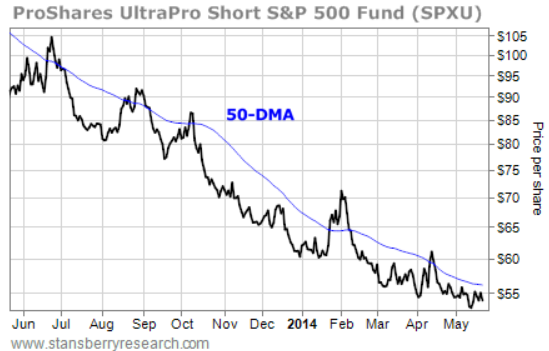
Take a look at this chart of the ProShares UltraPro Short S&P 500 Fund (NYSE: SPXU, Stock Forum)..

SPXU is a leveraged inverse fund designed to return twice the inverse performance of the S&P 500. In other words, if the S&P 500 falls 1%, SPXU should rally 2%, and vice versa.
So as the stock market has moved higher throughout the past year, SPXU has moved lower.
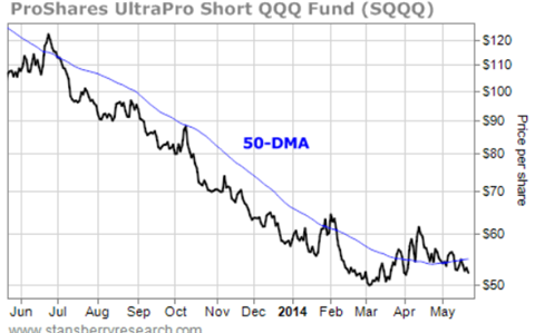
Like SPXU, the ProShares UltraPro Short QQQ Fund (NYSE: SQQQ, Stock Forum) is a leveraged inverse fund. It's designed to return twice the performance of the Nasdaq 100 – an index made up of the 100 largest nonfinancial companies listed on the Nasdaq exchange. The biggest weightings in this index are Apple, Microsoft, and Google.
And it also moved lower while the stock market moved higher this year...

SPXU and SQQQ are both plotted along with their 50-day moving averages (DMAs). Most technical analysts view the 50-DMA as the line in the sand separating immediate-term uptrends from immediate-term downtrends.
As I mentioned, these funds have moved lower throughout the past year – with their 50-DMA lines providing solid resistance. You can see the multiple times when SPXU and SQQQ bumped into resistance and then turned back lower.
The few times SPXU and SQQQ broke above their 50-DMAs – like in February and April of this year – coincided with brief and mild corrections in the stock market.
In each case, though, their 50-DMA lines were pointing lower. That indicates strong downside momentum and suggests any move above the 50-DMA will be temporary.
Now, however, the 50-DMA lines are starting to curl up. The momentum is changing to the upside. So the next time SPXU and SQQQ pop above their 50-DMAs, it's likely to lead to a far more significant uptrend in these funds.
Remember, since these are inverse funds, significant uptrends in SPXU and SQQQ will coincide with significant downtrends in the S&P 500 and the Nasdaq 100.
Keep watching the VIX. But keep an eye on these funds' charts, too. They'll give you fair warning when it's time to get out of stocks.