Over the years, Stansberry Research has uncovered dozens of "hidden" relationships in the stock market...
Today, I'm going to reveal the most important relationships... how you can track them... and how they can make you money.
For today's addition to your "trader's toolbox," we're going to look at half a dozen charts. Bear with me... this is extremely valuable information. Once you understand these ideas, you'll have a new level of market understanding.
I'll start with the basics...
In October, I showed you
there are two sides to every price. My colleague Brian Hunt explains the concept like this: "
On one side, you have the product, service, or asset being measured. On the other side, you have your 'measuring unit,' like dollars or euros or ounces of gold."
Whenever you look at a chart, you need to keep in mind that the line moves according to changes in both the asset being measured
and the measuring unit.
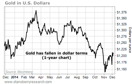
Take a price chart of gold over the past 12 months, for example. Gold's price is measured in U.S. dollars:

Since March, gold has dropped 13% against the U.S. dollar... During the same period, the U.S. dollar is up 12% against a basket of foreign currencies. So the chart above is as much a picture of a rising dollar as it is a drop in gold.
Change the measuring unit, and you change the chart.
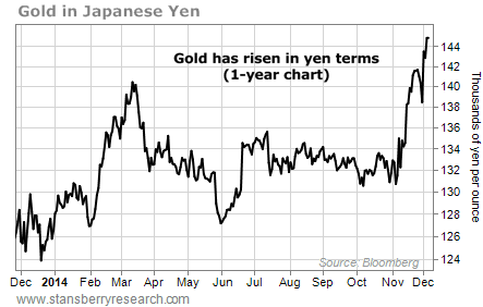
Here's the price of gold measured in Japanese yen. Over the past few years, the Japanese central bank has embarked on a massive campaign to stimulate its economy. This campaign has caused the yen to plummet in value.
If you live in Japan, gold just hit a new 52-week high. You can see gold's bull market in terms of yen in the one-year chart below:

The idea is that every price chart is a "ratio" chart – an asset (like gold) plotted in terms of a currency.
Here's the thing: Sometimes currencies don't give you the clearest picture. Sometimes it makes sense to plot an asset in terms of another asset. This can reveal "hidden" relationships... and show you
tradable extremes.
Consider natural gas... Here's the long-term price chart of natural gas in U.S. dollars.
You can see that starting in the late 1990s, natural gas prices soared... They peaked in 2006... and bottomed in 2012 below $2 per thousand British Thermal Units (or MMBTU, a common unit of measure for natural gas).
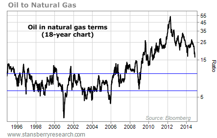
Here's another way to look at natural gas... It shows the ratio of oil to natural gas.

Oil and natural gas are both hydrocarbons. They're produced together. They're major sources of energy. So it makes sense the prices of the two assets are linked... As you can see, historically, the price of oil has been about six to 10 times that of natural gas.
Of course, tensions in the Middle East can cause oil prices to rise. An especially cold winter can cause a spike higher in natural gas. Changes in supply and demand affect both assets... And sometimes, the price of one reaches an extreme relative to the other.
That's exactly what happened in 2012. The U.S. was producing so much natural gas, the ratio of oil to natural gas reached 53 – a huge, once-in-a-generation extreme. To return to their historical relationship, either oil prices had to collapse or natural gas prices had to soar.
Oil prices are down about 35% since then... And natural gas prices have doubled. The big Canadian natural gas producer Peyto Energy rallied 100% in less than two years after the bottom. Many other natural gas producers staged large rallies as well. The "ratio" of oil to natural gas alerted traders to the opportunity.
Let's look at another "hidden" relationship...
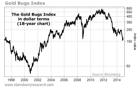
Below, you'll find a chart of the popular "Gold Bugs Index" over the past 18 years. The index tracks a basket of gold stocks.

In U.S. dollar terms, gold stocks bottomed in 2000, peaked in 2011, and recently hit a 10-year low.
But this chart doesn't say anything about the value of gold stocks.
Companies that mine gold live and die based on its price. When the price of gold is too low, they lose money. When gold prices soar, profits go through the roof. You can't know if gold miners are cheap or expensive without factoring in the price of gold.
You can do that with a ratio chart of gold-mining stocks to gold...
This ratio chart looks a lot different than the first one... It recently hit a multi-decade low. Compared with gold, gold stocks look dirt-cheap.
The last time the ratio hit such a low level in late 2000, major gold stocks like Goldcorp and Newmont Mining went on to rally 414% and 217%, respectively, over the next three years... while the price of gold only went up 43%. If you were considering an investment in precious metals, gold stocks were clearly the better choice.
Of course, extremes like this can always get more extreme... We've seen that with gold stocks over the past three years. But when they reverse, the gains can be extraordinary.
Other "hidden" relationships I like to track are gold to silver... gold to platinum... junk-bond yields to 10-year Treasuries... gold to stocks... and coal to natural gas.
Knowing about these relationships allows you to see things others do not. They will give you a level of market understanding most people will never have. And they'll allow you to make great money in trades other people could never imagine...