Euphoria is a type of market rally where valuations, real market expectations, and global market concerns are pushed away from view while a trader based rush to rally takes place. One of the clearest examples is the 1995 to 2000 DOT COM US stock market rally. As the Internet burst into homes and businesses across the world, the US-led the way with dozens of new Internet-based IPOs touting glorious expectations, potential earnings and more. Everyone had the idea this new medium would dramatically change the economy for the better and breakthrough traditional economic boundaries.
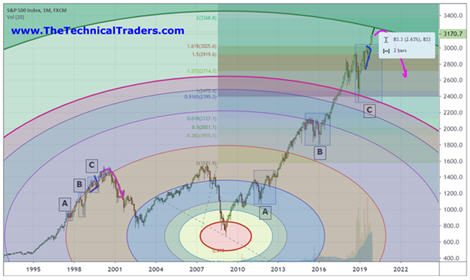
The rally that took place in 1995 through 2000 was incredible. The S&P 500 rallied from 463 to 1535 - +235.57%. What we find interesting is the “price wave formation” that took place within that rally. There were a number of key price rotations that took place as the market continued to rally, we've labeled them A, B, and C. The first rotation, A, took place in July~Dec 1997. The second, B, took place from May 1998 to November 1998. The last, C, took place between January 1999 and November 1999. Technically, these rotations are significant because they represent “true price exploration” related to price advancement. The price must always attempt to identify true support/resistance levels while trending.
When we compare the rally from 1995 to 2000 with the current rally in the US stock market, we can see a defined level of euphoric price advance after the 2016 US elections. We must also pay attention to the previous price advance from the 2009 price lows as the global markets were struggling to recover from the Credit Crisis. Our research team identified the A, B, C rotations in the current price and associated them to the similar rotations in the 1995-2000 price rally as “key components of the current rally and a potential warning sign of a pending top formation”.
Our researchers believe the QE processes of the global central banks have set up a similar type of euphoric price rally in the current global markets even though current economic metrics are warning of weakening economic activity and weakening global market output. The US Fed and global central banks seem to want to keep pumping money/credit into the global markets to keep the rally going – most likely because they are fearful of what a crash/correction may do to the future growth opportunities around the planet.
Yet, our research team focused on the C rotation in 1999 and 2019 – a full 20 years apart. What interested our research team the most was the fact that the rotation in 1999 set up a full 21 months before the November 2000 US Presidential election. The current C rotation initiated in January 2018 – a full 34 months before the November 2020 US Presidential Elections. Anyone paying any attention will recognize the 21 and 34 are both Fibonacci Numbers – relating a 1.619 ratio advancement.
Are we setting up a massive top in the US stock market based on a Fibonacci price range expansion related to the patterns we have identified in this SP500 chart? Have we advanced from the 2000 peak and 2009 bottom in some form of Fibonacci Ratio expansion that aligns with the C rotation pattern we have identified?

The rally from Bill Clinton's second term start date to the peak in 2000 totaled 932.9 pts - +153.61%. the rally from Donald Trump's first term start date to our projected peak level totals 997.5 pts - +44.38%. The rally in 2000 peaked at a range that is 200% larger than the ration between the two separate percentage point ranges. Is this significant to traders? Does it help to align our peak with the 1.619 Fibonacci ratio?
153.61 / 44.38 = 3.4612
3.4612 / 2 = 1.7306
Given the alignment of these values with a potential 200% range expansion theory, we need to start to look at TIME/PRICE ratios to determine if these rallies are aligned efficiently.
The rally from 1995 to the peak in 2000 consisted of 63 Months. The rally from 2009 to our projected peak consists of 131 bars. This represents a price TIME expansion of 207.9%
The rally from 1995 to the peak in 2000 consisted of a price move of +1081.2 pts (+235.57%). The rally from 2009 to our projected peak consists of a price move of 2585.6 pts (390.49%). The ratio between these two price expansions is 1.657.
The correction from the peak in 2000 to the low in 2009 consisted of 109 months. The ratio between the 63 months (1995~2000 peak) to this correction time is 1.73. The ration of the 2009~2019 rally time span is 1.20. Thus, the correction between the peak in 2000 to the bottom in 2009 expanded at a rate of 1.73x the time it took to complete the DOT COM rally from 1995 to 2000. The recovery that has taken place from the 2009 bottom to our projected top in 2019 would expand at a rate of 1.20x the correction time rate. All of these levels align with common Fibonacci numbers and ratios.
In other words, we believe the current expansion in price is nearing a completed Elliot Wave/Fibonacci ratio peak (likely wave C) that maintains proper aspect ratios related to previous major price rotations.
Other major sectors and asset classes also look to be showing similar topping patterns like the
real estate values and charts here.
Custom Volatility Index Monthly Chart
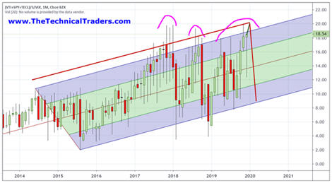
Our Custom Volatility Index shows extended volatility is increasing with price nearing the upper range for December 2019. Notice the increase in the range of these bars since the just before the peak in January 2018. This increased range suggests extreme price volatility has been pushing the markets for the past 24+ months. If this volatility continues into early 2020 as our projected peak sets up, we may see some very big rotation in 2020.
 2000 and 2019 Price Similarities in S&P 500
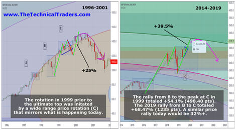
This 2000 peak to 2019 peak comparison chart highlights the similarities in the C price pattern that has setup. In 1999, the C pattern set up with an initial peak, followed by minor downside rotation – just like in January 2018. The second peak was higher, followed by a much deeper downside price rotation – just like in Nov/Dec 2018. And the final rally broke upward after a Pennant/Flag formation pushing higher by +25% in 2000. The current upside breakout from the December 2018 lows suggests a 39.5% price peak – just above our predicted 32% scaled Fibonacci rally expectation.
 Fibonacci Price Amplitude Top Level Is Not Much Higher
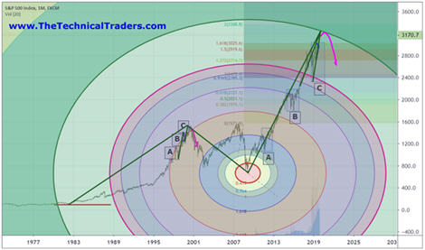
The total scope of this price move over the past 40+ years is impressive. These longer-term patterns still drive the markets to establish major peaks and valleys. Take a look at this chart and try to understand the ratios that are being presented here. 21%, 34%, 50%, 62%, 100% and any combination of these levels using 2x, 3x or any multiplier constitute a Fibonacci structure. One of the most important facets of attempting to understand the Fibonacci price theory is that the ratios must be somewhat aligned.
Pay attention to the Fibonacci Price Amplitude arcs (the circles) drawn on this chart. They represent the price range from the peak in 2000 to the low in 2009. The reason this range is important to our researchers is that it will properly measure the previous upward price rally and the current price rally in terms of price amplitude. Pay attention to how the current price rally stalled and rotated near these arcs. We believe the upper GREEN arc level will operate as major resistance for the markets – possibly setting up another “rollover” type of top similar to the one in 1999~2000.

Skilled technical traders still need to be cautious headed into 2020. The current rally, and most of 2018 and 2019, have been setting up a very serious type of pre-top setup. Any downside rotation in early 2020 may attempt to move lower in multiple waves – possibly spanning multiple years.
Currently, our research suggests a limited 2.5% upside price range before the SP500 will reach the GREEN resistance arc. The US markets may reach this level before the end of 2019 and may begin a topping pattern before you finish reading this article. Please stay informed and understand the structures, trends, and dynamics that are at play in these markets to attempt to reduce your risk. Now is the time to trim your equity/stock positions and prepare for a much bigger swing in price/volatility.
As a technical analysis and trader since 1997, I have been through a few bull/bear market cycles. I believe I have a good pulse on the market and timing key turning points for both short-term swing trading and long-term investment capital. The opportunities are massive/life-changing if handled properly.
We’ll keep you informed as this plays out with
Wealth Building & Global Financial Reset Newsletter if you like what I offer, join me with the 1 or 2-year subscription to lock in the lowest rate possible and ride my coattails as I navigate these financial market and build wealth while others lose nearly everything they own during the next financial crisis. Join Now and Get a Free 1oz Silver Round or Gold Bar Shipped To You!
Chris Vermeulen
Founder of Technical Traders Ltd.
www.TheTechnicalTraders.com