That was fun wasn’t it? S&Ps lost a cool 13% since the last week of 2015. You think that’s a lot? Emerging Markets lost 16% during that period. The Russell 2000 Small-cap Index lost over 17%. Micro-caps lost over 18%. 13 is nothing. And get used to it, because I think there is a lot more selling coming.
Today, we’re going to focus on what the S&P 500 (INDEXSP:.INX) looks like because that is what all of you keep asking me about. I like to look at stock markets from a more global perspective, taking into account what other asset classes are doing like commodities, currencies and interest rates. Remember, I’m in the weight-of-the-evidence business. I believe that in order to navigate through what is a constantly evolving global marketplace, taking the weight-of-the-evidence is the best approach. But today, we’ll take a deep dive look at S&Ps on their own.
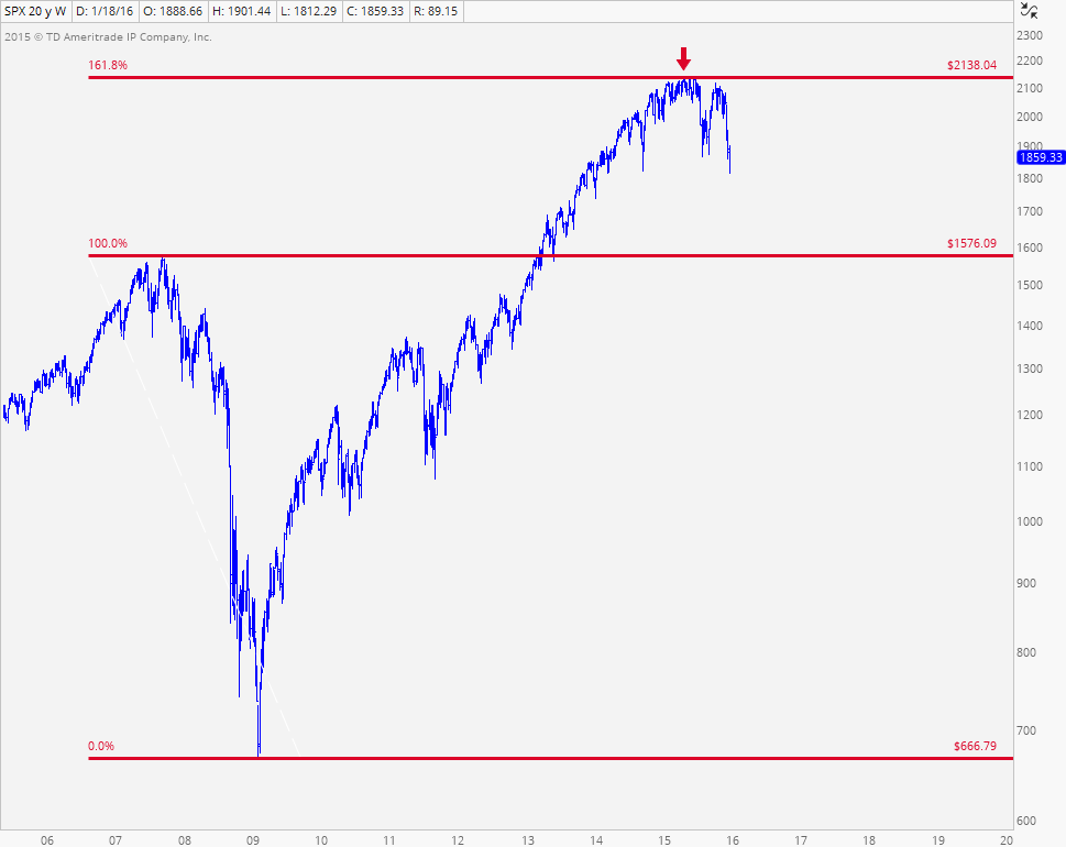
The first chart is one that I’ve shown you guys, I don’t know, about 1000 times over the past year. It shows S&Ps running into the 161.8% Fibonacci extension of the entire 2007-2009 decline. This has suggested to us since last May that there was no reason to be long the U.S. Stock Market from any kind of long-term horizon:

Looking at things from a ...
/www.benzinga.com/etfs/broad-u-s-equity-etfs/16/01/6159635/the-s-p-500-lost-13-in-3-weeks-so-now-what alt=The S&P 500 Lost 13% In 3 Weeks. So Now What?>Full story available on Benzinga.com
 More...