There has never been any “U.S. economic recovery”. This laughable mythology is ½ the product of falsified government statistics, and ½ the product of relentless brainwashing from the Corporate media – the handful of mega-corporations which control almost everything we see and hear. In reality, there is only the U.S. Greater Depression: the relentless, irreversible decline of this once-great economic power.
When one hears talk of “the U.S. economic recovery”, what is the single metric used most often to supposedly prove the myth? Jobs. Lots and lots of jobs: 15 million net, new jobs, to be precise. That was the preposterous claim made by the Obama regime during its eight years of economic mismanagement.
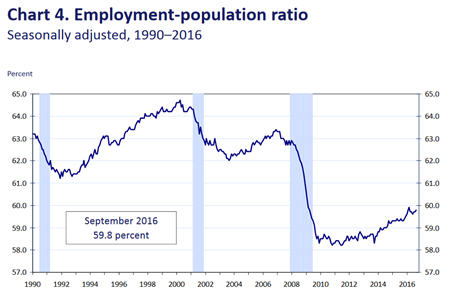
The chart above, courtesy of the Federal Reserve, is the U.S. civilian participation report. It tallies the total number of Americans with jobs and expresses this as a percentage of the overall population. What we see is a significant plunge in the total number of Americans with jobs – and no recovery. The decline from roughly a 63% employment level down to a less-than-60% employment level represents the loss of approximately 4 million jobs.
What is equally interesting is to see how this chart has changed in recent years. Here is the same chart from roughly three years ago.
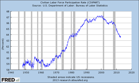
What we see very clearly in this earlier version of the chart is that the loss of jobs in the U.S. economy actually accelerated during the supposed U.S. recovery. Now look at the doctored 2016 version. We see the Federal Reserve retroactively falsifying the numbers, to make it look like all of the job-losses occurred before the mythical “recovery” began.
During the supposed U.S. recovery, the U.S. economy has lost 4 million net jobs, not gained 15 million net jobs. This is a total jobs-lie of 19 million jobs, or more than two million imaginary jobs for every year that Barack Obama was in office.
However, this is far from the only unequivocal indicator that there has never been any “growth” in the U.S. economy since the Crash of ’08. Growing economies use more energy. It’s a pretty simple equation. This is especially true with so-called “consumer economies” (like the United States) because to consume goods it is necessary to transport goods – and that requires significant amounts of energy.
(Source: World Economic Forum)
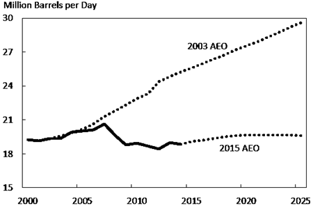
The picture above shows the level of deterioration in U.S. economic activity between 2003 and the present. The 2003 dotted line projects U.S. petroleum consumption on the trend which existed at that time. The second dotted line plots the current trend for U.S. petroleum consumption, based upon 2015 consumption levels. What we see is a sharp decline from 2008-levels, and no recovery. However, the data becomes even more illuminating when we examine a second version of this same chart.
(Source: World Economic Forum)
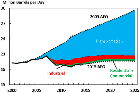
What we see very clearly is that the primary divergence between the 2003 trend and the 2015 trend is a dramatic plunge in transportation activity. We also see a significant decline in the trend of industrial activity, as well as a smaller decline in petroleum usage at the consumer level.
In an article from the World Economic Forum which attempts to explain these “surprising” charts, the WEF notes that of the massive plunge in the trend for transportation petroleum consumption, only 25% of that decline comes from increased energy efficiency, while 75% of the decline is the result of decreased petroleum consumption in the U.S. transportation sector.
The Baltic Dry Index is arguably the bellwether metric for the global economy. It is a measurement of global shipping activity, and it is considered to be an economic bellwether because commercial transportation activity is (arguably) the most-accurate indicator of global economic health. There is no way to rationalize the previous two images with any semblance of “health” in the U.S. economy.
A consumer economy where transportation is stagnant and employment is declining? Obviously this is not a growing economy. So do we explain quarter after quarter, and year after year of U.S. GDP “growth”? Very easily: more statistical falsification.
Falsifying GDP is the easiest of all economic statistics to fabricate, since all that is required is to lie about inflation – where the U.S. government is the undisputed world champion. Year after year, we have the charlatans at the Federal Reserve lamenting that “inflation is too low”. It’s been their principal excuse for eight years of stalling on their promise to immediately normalize U.S. interest rates.
Back in the real world, we have John Williams, of Shadowstats.com. Mr. Williams is a respected economist who has previously been invited to testify before the U.S. Congress. He calculates U.S. inflation without the devious (and laughable) “adjustments” which have been made to this calculation over the past 20 years. Williams consistently pegs U.S. inflation between 4% and 8% -- not near-zero.
To calculate a (legitimate) estimate of gross domestic product, the calculation must be fully “deflated” by the prevailing rate of inflation, in order to strip out the effect of price increases. The U.S. government has not been doing this. It’s “deflator” has also been near-zero. Thus for the past eight years, what the U.S. government calls “GDP growth” John Williams has proven is nothing more than unreported inflation.
Undoubtedly there will still be many skeptical readers out there. After being told every day of every week of every month of every year that the U.S. economy has been “recovering”, it’s not easy to accept that this has been nothing but falsified statistics.
For these readers, here is one more picture: the U.S. velocity of money. In capitalist economies, the velocity of money roughly equates to the “heartbeat” of an economy: you don’t want it to go too high, and you certainly don’t want it to go too low.
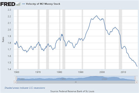
The picture above is of a dead economy: a heartbeat which was plummeted far, far below any previous
minimum reading in U.S. history – and is still falling. RIP.